
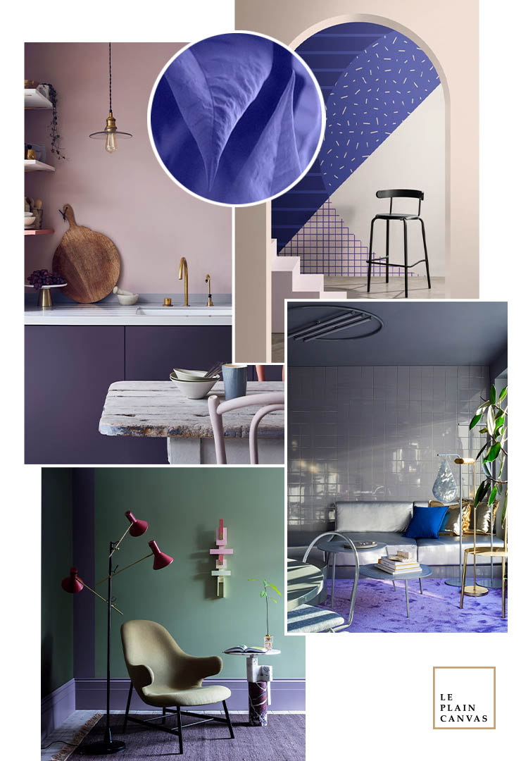
Lo and behold, Pantone has unveiled its 2022 Color of The Year, Very Peri! As its name suggests, Very Peri, or PANTONE 17-3938, is a warm and confident greeting of dynamic periwinkle blue with violet-red undertones.
Celebrating how our lives have changed pandemic-wise and how it pushed our creativity to break boundaries. Pantone’s colour experts dug deep into their colour palettes to select one that perfectly encapsulates the “carefree confidence” and “daring curiosity” the world witnessed from the past two years.
Too much of one colour would be overwhelming, and for colour as bold as Very Peri, the execution must be calculated carefully. One of the best ways to use Very Peri would be as an accent colour – on pillows, quilt covers, vases. Adding the dynamic fusion of red-violet and blue hue into a kitchen space can encourage creativity and experimentation – something always welcomed in the art of cooking! Using wallpaper to revamp kitchen counters and surfaces can be a low commitment to incorporating different textures, materials, and Very Peri.
It has become our favourite colour of the year, how about you?
xoxo, Joe
Credit | All shots used on the mood board via our Pinterest boards.


No Comments