
Many of us would have made a pilgrimage to Japan around this time of the year to enjoy the cherry blossom season – sitting under the canopy of blooming flowers, palest pink petals fluttering all around us as we enjoy our bento and matcha. Alas, it will take some time to be able to do the hanami that we planned to. But we can take inspiration from it for our spaces.
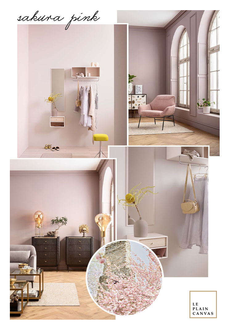
Pink is generally a joyful colour, and this gentle sakura shade can be incredibly calming and comforting. When applied to space, this colour will help create a very tranquil and serene atmosphere. For instance, this entryway furnished with shelves, which features a blush-toned neutral called Oat that brings out the warm pink undertone of the timber flooring.
This almost-white sakura pink is beautiful when applied as the main colour. Go tone-on-tone across different materials, like timber, textiles or even leather to create a very sophisticated, layered look. As an accent, it pairs well with neutrals and monochromatic. Pops of pale pink against white or dark grey or black make for a chic look.
Do you like this Apirl Pantone colour like us?
xoxo, Joe
Credit | All shots used on the mood board via our Pinterest boards.


No Comments