
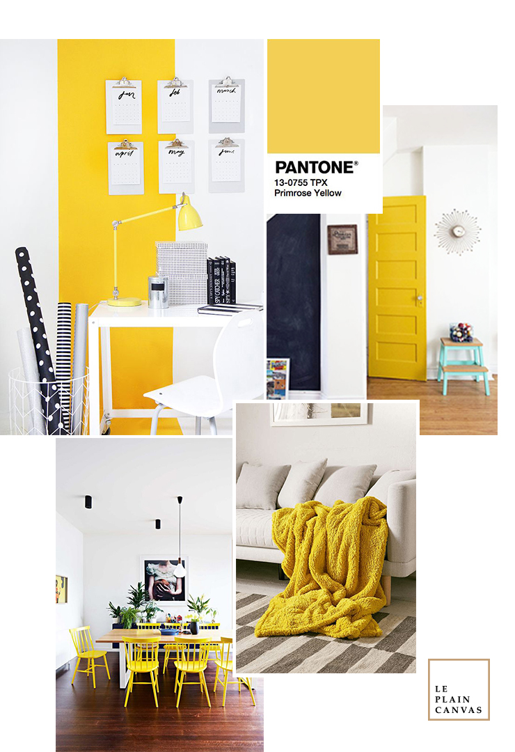
Greenery has been one of our favorites during this spring, as it evokes Granny Smith apples or butter lettuce. However, the other tone that caught our eyes in the Pantone’s Spring 2017 Fashion Color Report: Primrose Yellow.
Primrose Yellow sparkles with heat and vitality, conjuring thoughts of a warm, sunny day. It’s a cheerful pop of color in the palette. In furnishings can have a similar effect on a room, when used in moderation. When using Primrose Yellow for home, it feels like a palette cleanser. It’s a color that can go hard-edge eighties, which makes it an ideal backdrop for avant-garde furniture pieces.
Where there are pops of yellow, it adds so much interest to the home. For us, we also love pairing the shade with rich blues, emeralds, and jewel tones for an “impactful and bold” look.
Sometimes just a little pop of color is more than enough.
xoxo, Joe.
Credit | All shots used on the mood board via our Pinterest boards.


No Comments