
 The enthusiasm with this year Pantone announcement it is just beyond amazing yet. While going through those shades, we decided to select several to share with you folks. Apart from the love with Greenery, there’s another colour we love this season.
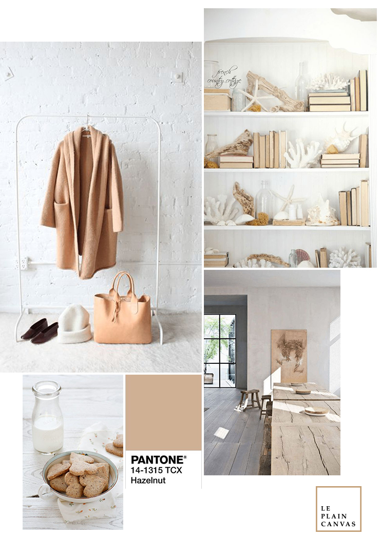
It’s Hazelnut, a refined, subtle, earthy tone we loved. Most of you will agree that it is a stand alone colour which is the best combination with earthy, rustic tone. Moreover, you could describe this colour as light brown, pale brown, caramel brown or camel tan. As it has a natural feel to it and adds a warm glow to any interior space. There are so many different ways you can work this hue into your next project. Here are some ideas you might like…
If you are a simplistic lover like us, you will be in love with Hazelnut. Hazelnut is a wondrous colour to work around with white, textured materials. Add white accents with slip covered seating and accent the room with green plants. So cosy! Or even add a touch of warmth to a white modern living room with a camel brown throw, to bright up the whole room.
Hazelnut is a wondrous colour to work around with earthy tone especially the white. It works with different textured materials as well, each will bring out a different touch of it. Hazelnut is all seasonal colour; Winter, Spring, Summer, and Autumn therefore for those decide to choose a colour for you living room, you could consider this! It’s a wonderful way to incorporate the cosy brown hue into your home design colour scheme.
xoxo, Angela.
Credit | All shots used on the mood board via our Pinterest boards.


No Comments